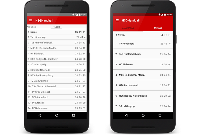
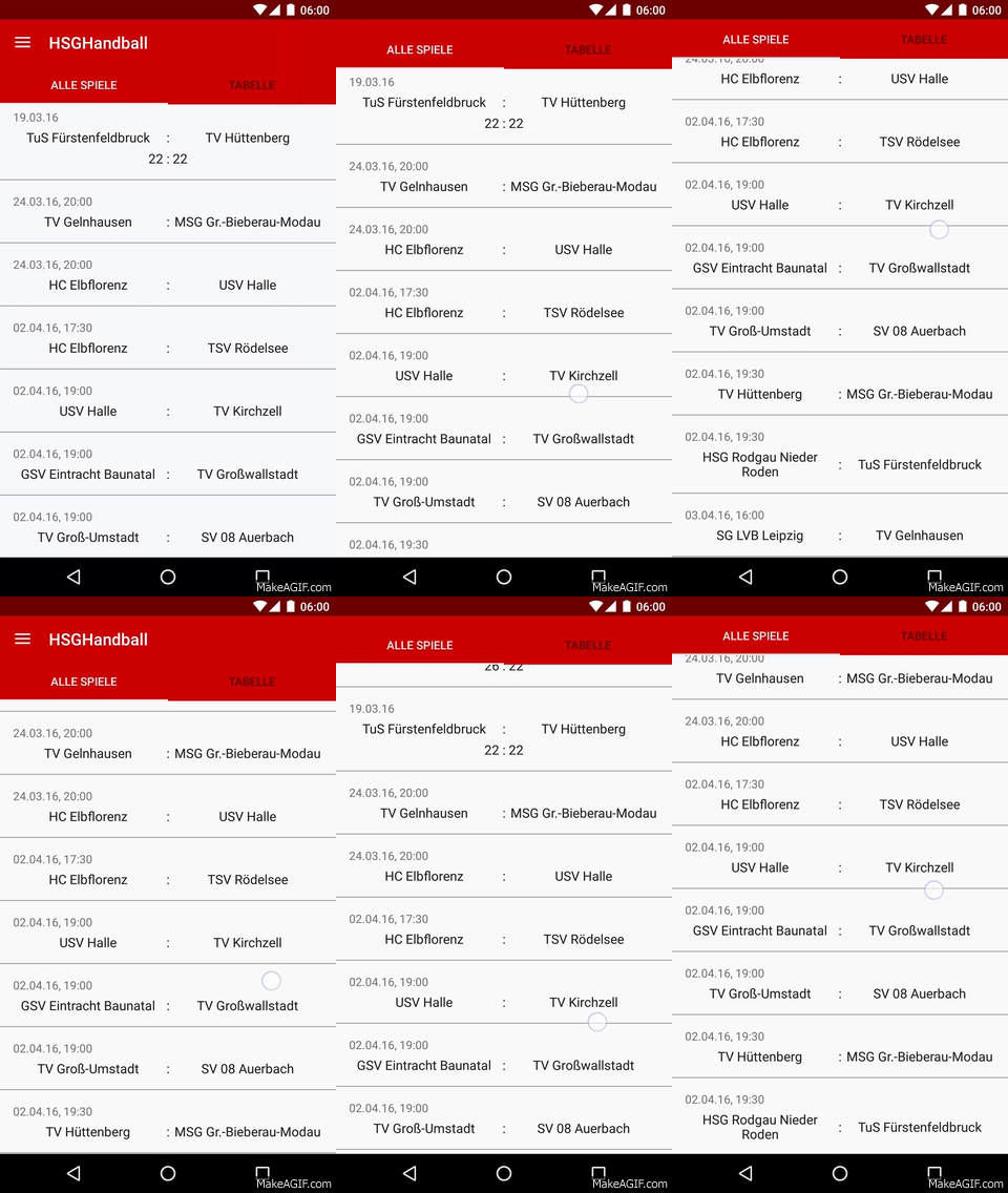
I have made a little App for our local handball sport team. The App can switch between the different teams and display the finished games and games to come. It can also display the current table in the league.
Not more and no less.
The first launch was in January 2015. Yes, that is almost one year ago. At this time Material Design was published but we developers hasn’t a style guide or something. So I have used metrics like I want. And yes, that was a bad idea.
However. I just want to share some screens to see that every developer can make their App a little bit more Material with some metrics and keylines. I haven’t change much more than take some hints from Googles official Design Guide.
I have linked some Material specification links from the current design site. Please note that the Design Guide is a living documentation and can be changed anytime!
Start / NavigationDrawer (Material specs):

Games (Material specs):

Table (Material specs):

Liveticker / WebView vs. Chrome Tabs:

LoadingScreen (Material specs):


ScrollingBehavior (Material specs):


BottomSheet (only available in the new version) (Material specs):

